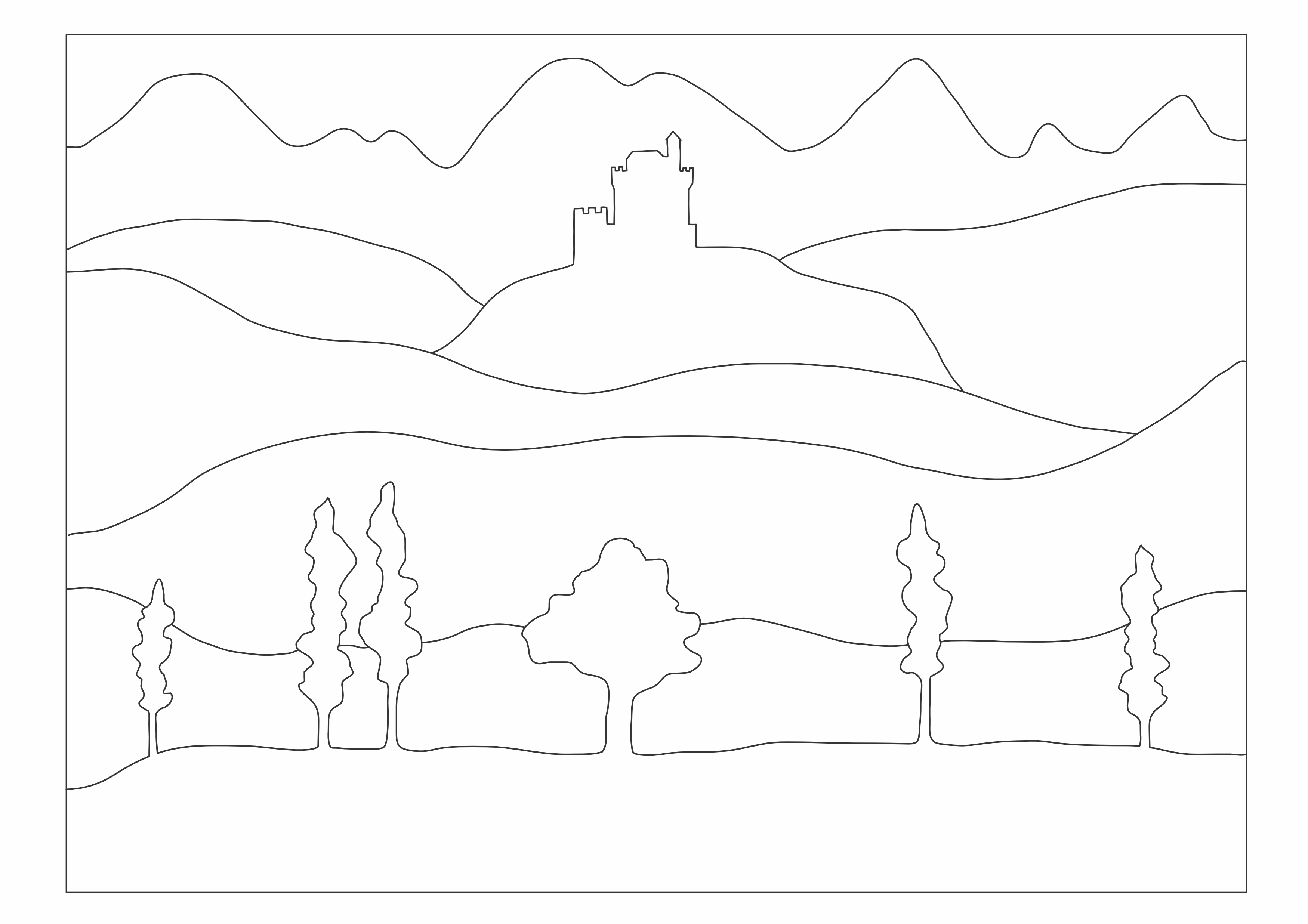
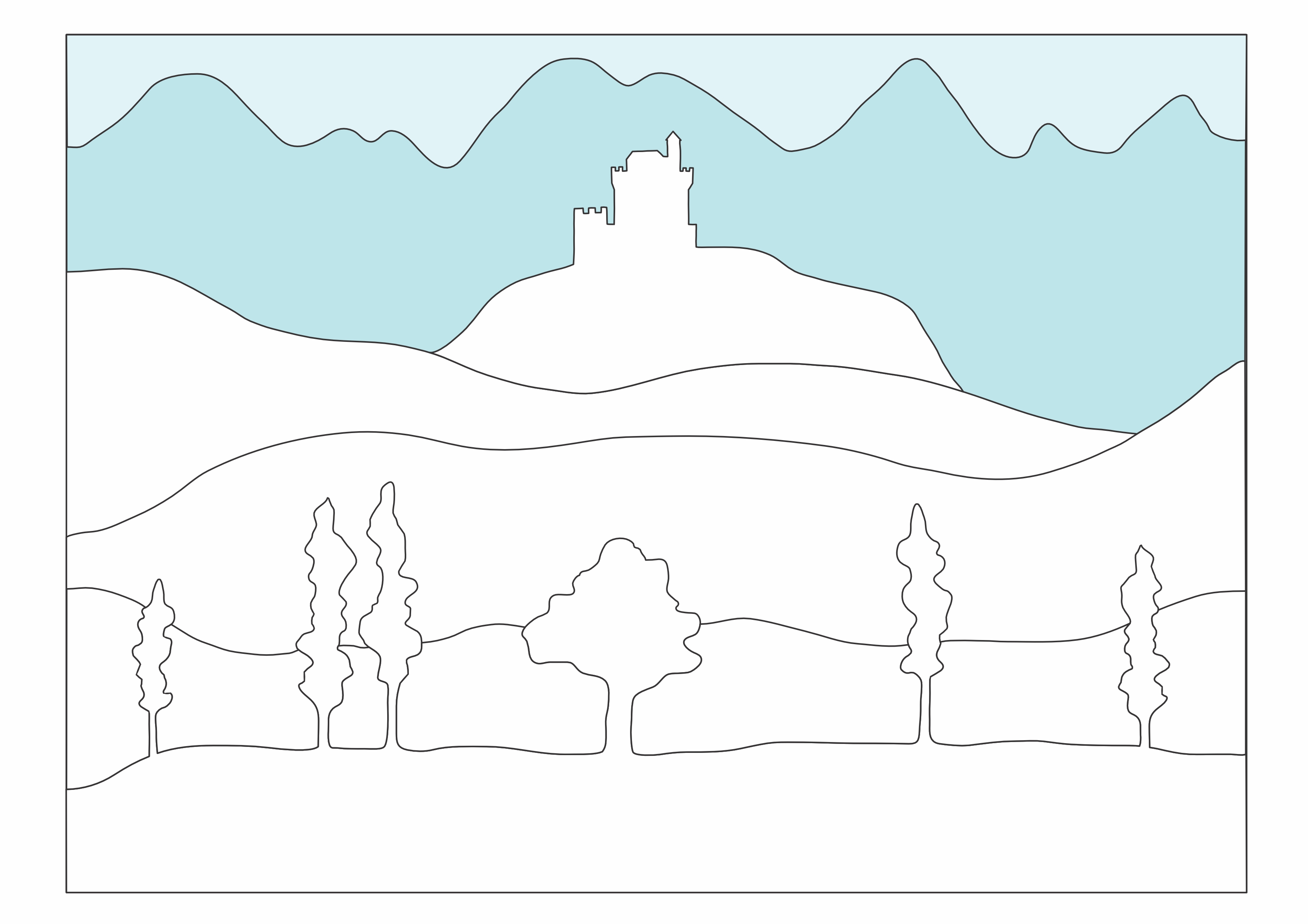
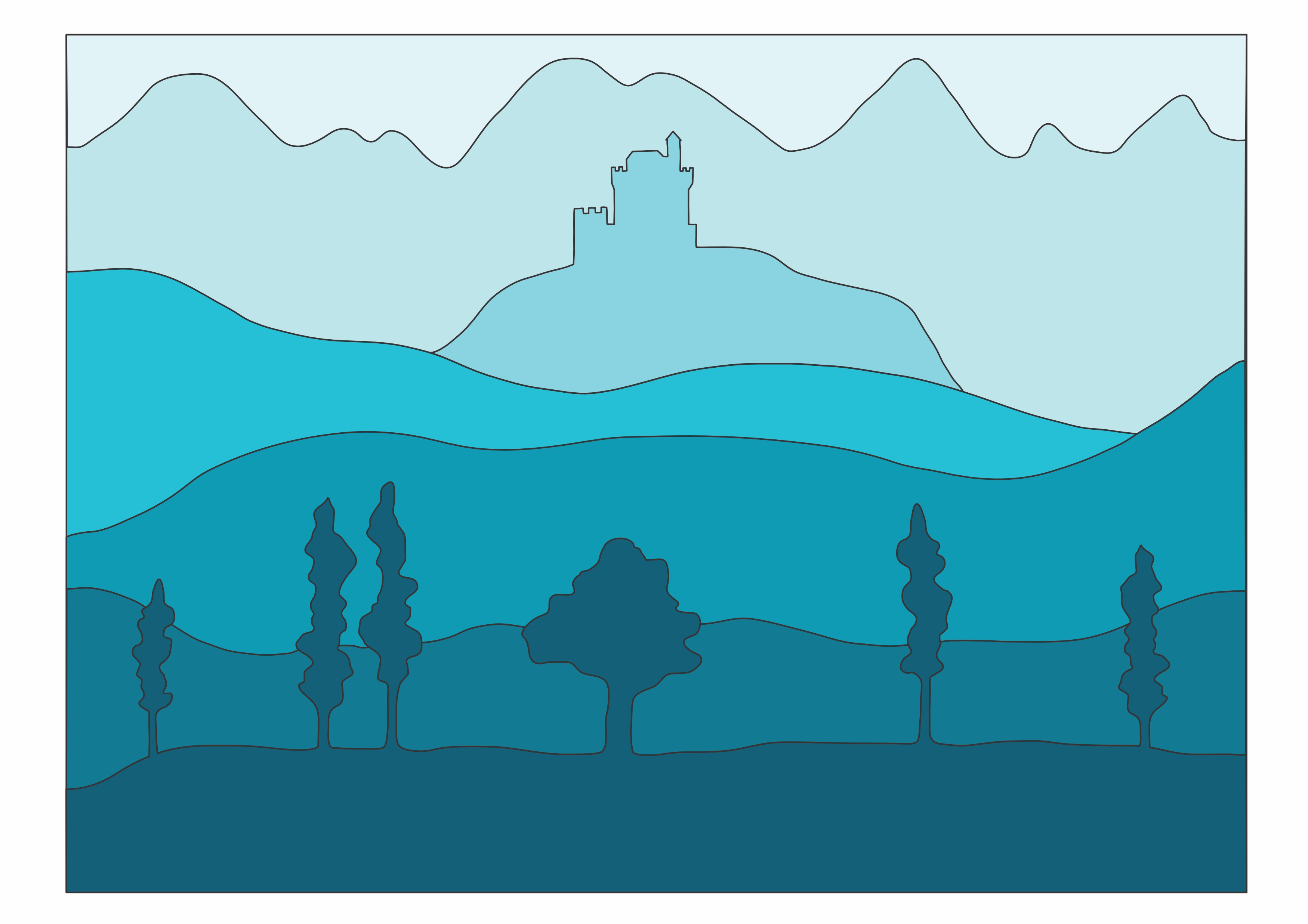
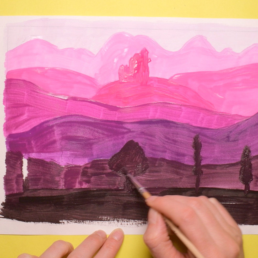
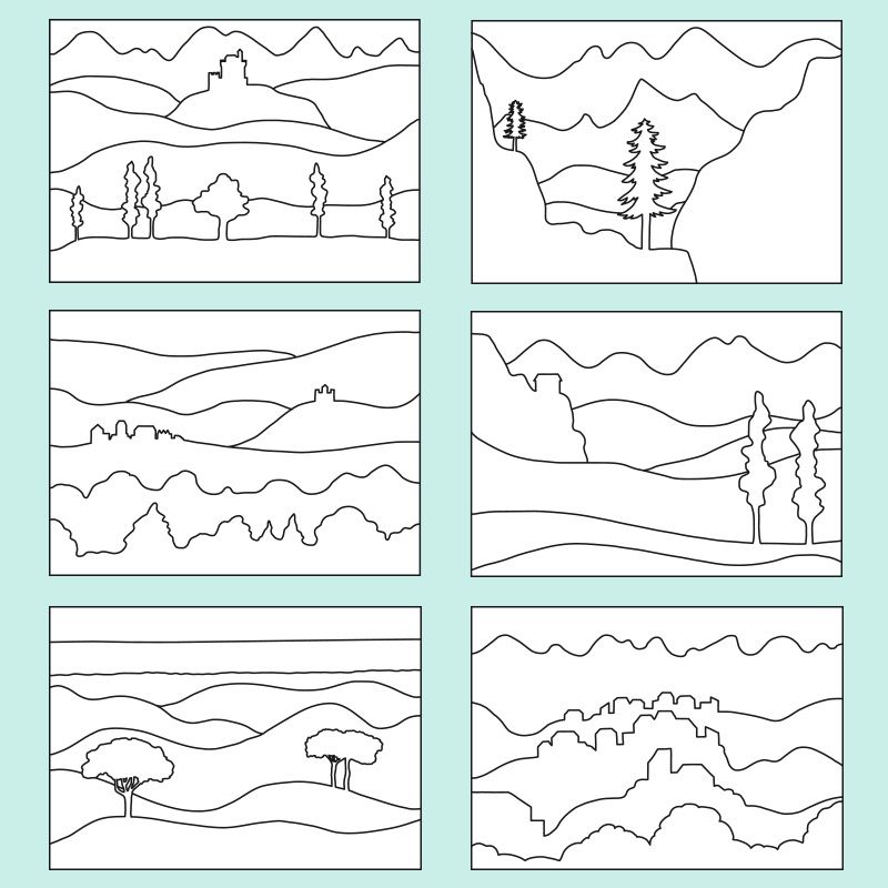
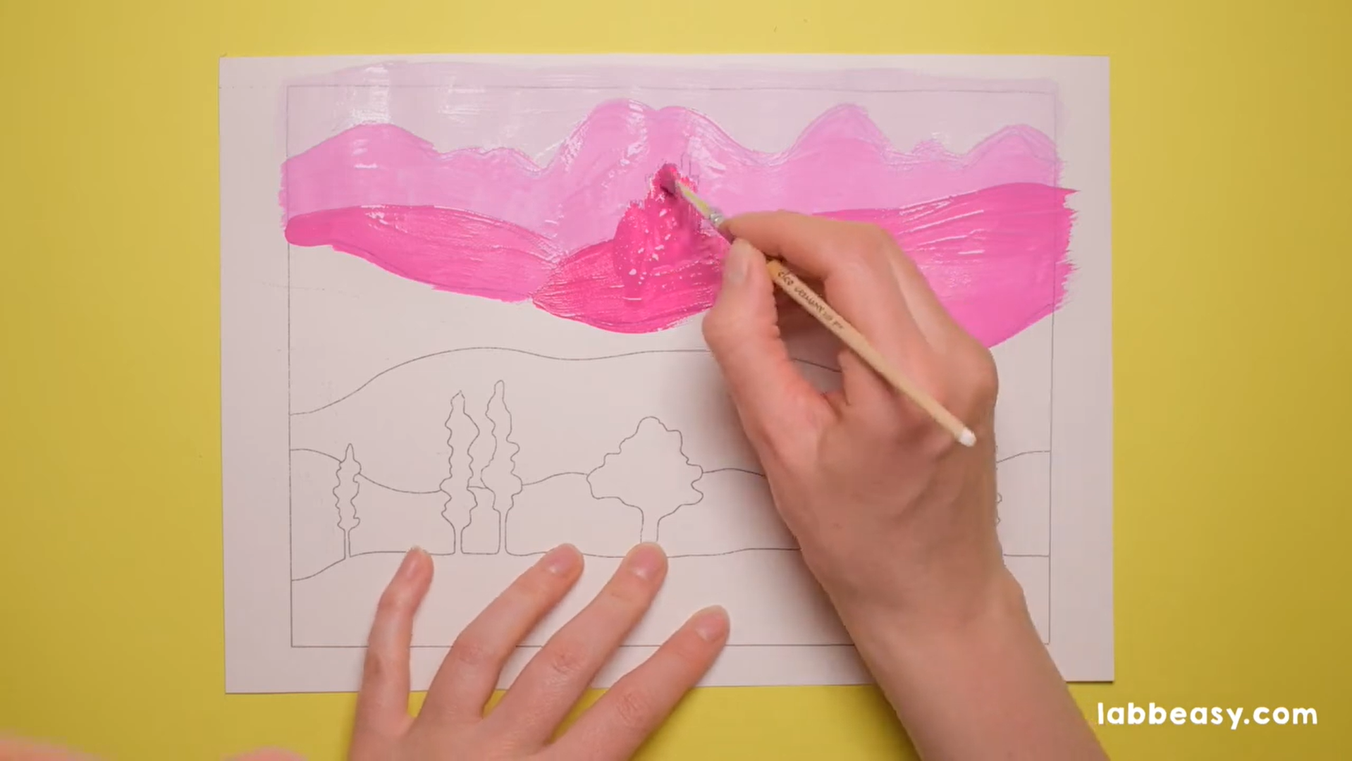
Get a copy of our Color Perspective - Landscape printable. Select the desired motif and print it out on heavy white printing paper.
How can I use this resource?
With these templates every school kid can now discover the phenomenon of color perspective for themselves. An exciting project for art class at school or as an art project at home.
What does this resource contain?
This material contains 8 different picture templates of landscapes to color - each in 3 sizes.
What is color perspective?
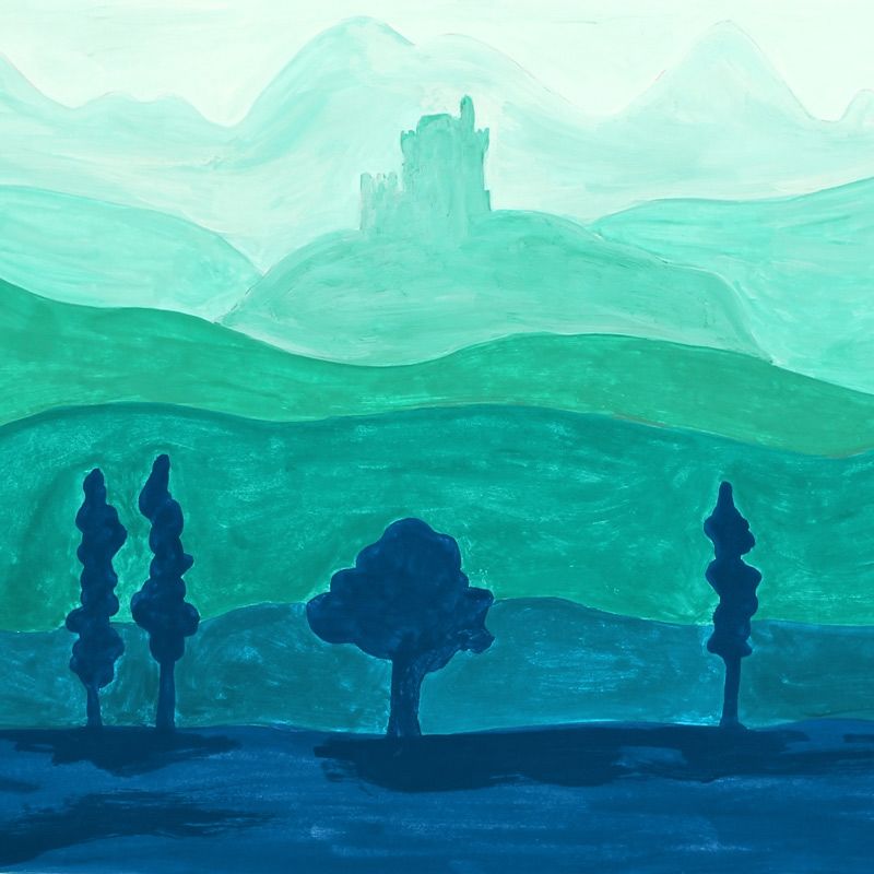
When you observe a landscape, you notice that as colors become more distant they become paler and less contrasting. At the same time, the colors become bluer and the contours become hazy. The reason for this change in atmospheric perspective is the way light refracts differently from color to color at varying distances.
The great
painters of the Renaissance, who worked with perspective, discovered how
to mimic this natural phenomenon through a targeted application of
nuanced color in the foreground, middle-, and background of a
two-dimensional picture. They experimented a great deal with mountain
landscapes, which they depicted impressively with the aid of this
color-based perspective technique.
The superimposition of mountain chains achieves the impression of spatial depth when you use predominantly warm tones – such as yellow, orange, red, and brown – in the foreground and predominantly cooler tones – such as green, blue, and purple – in the background. The intensity of a color‘s tone also affects color perspective. The more saturated a color is, the closer it is perceived to be.
Labbé GmbH
Walter-Gropius-Str. 16
50126 Bergheim
Germany
hello@labbeasy.com

